I’m currently making my way through Complexity and the Economy by W. Brian Arthur. The book’s second chapter is a paper from 1994 called Inductive Reasoning and Bounded Rationality: The El Farol Problem. It’s a fantastic example of how marrying psychological insights and a computational approach can produce novel and intuitive research in economics. So, I thought I’d have a go at using R to reproduce my own (simpler) version of the model described in the paper.
Background
When Arthur was working at the Santa Fe Institute in 1993, there was a bar called El Farol with Irish music on Thursday nights. He noticed that people would go if they expected few people to be there, but avoided it if they expected it to be too busy.
This is interesting on two fronts.
First, there is no ‘correct’ deductively rational solution for someone trying to decide whether or not to attend based on their prediction for this week’s attendance. This is because their prediction is based on what they believe other people will do. But, what those other people will do is simultaneously based on their predictions of what everyone except themselves will do. Thus, our focal agent ends up in a kind of reflexive preference loop in which their prediction is a function of every other agent’s prediction which are themselves functions of every other agents’ predictions, and so on and so on for as long as you can be bothered to think about it.
Second, it creates something of a paradox where common beliefs lead to outcomes that cause those beliefs to be proved false. If most people expect many others to attend, then few will show up and the bar will be almost empty. If most people expect nobody to attend, then everyone will show up and it’ll be packed. In both cases the original common belief causes behaviour that means that belief ends up being incorrect.
These two interesting aspects of the problem should be incorporated in our model if we want it to be useful. So, we need to allow agents to reason inductively by testing a set of hypotheses against reality and choosing to use the one that seems to work best at the present time. We also need to allow our agents to have different sets of hypotheses from one another i.e. different inductive rules about the world that they’re testing.
But if everyone is inductively reasoning from a multitude of different starting beliefs, then won’t we just get completely random attendance over time? Let’s generalise the problem in a toy model similar to Arthur’s to gain some insight into the dynamics of attendance and find out.
Model
Set-up
100 people decide independently each week whether or not to attend a bar that offers music on a certain night. The music is enjoyable if the bar isn’t too busy, specifically if fewer than \(X\%\) of the possible 100 people attend. There’s no way to tell in advance how many people will show up. So, each person goes if they expect fewer than \(X\) people to attend but stays home if they think more than \(X\) people will be there.
There’s no collusion or prior communication between possible attendees and the choice isn’t affected by whether the person was right or wrong in their beliefs about previous visits. The only info available is a list of the number of people who came in the past weeks.
For example, the past 10 weeks’ attendance might be:
Show code
# Example attendance
set.seed(23)
round(truncnorm::rtruncnorm(10, 0, 100, 50, 20), 0)
[1] 54 41 68 86 70 72 44 70 51 82Each of the 100 people can individually form different hypotheses they could use to predict the next week’s attendance based on the figures for the past weeks. For example, their hypotheses could include:
- Predict the same as last week \(\rightarrow\) 82 people
- Predict a mirror image around 50 of last week \(\rightarrow\) 18 people
- Predict the average of the past four weeks \(\rightarrow\) 62 people
Each person decides to go out or stay in according to the currently most accurate hypothesis in their individual set. If their best predictor says that fewer than \(X\) people will go, then they go. If their best predictor says that more than \(X\) people go, then they don’t.
R function
Show code
sim_el_farol <- function(threshold = 60, n_rounds = 100) {

  ## Define mean-based hypotheses -----

  # Mean of previous 1 week
  mean_1 <- function(x) {
    if(length(x) < 1) {sample(c(1:100), 1)}
    else{mean(x[length(x)])}
  }

  # Mean of previous 2 weeks
  mean_2 <- function(x) {
    if(length(x) < 2) {sample(c(1:100), 1)}
    else{mean(c(x[length(x)], x[length(x) - 1]))}
  }

  # Mean of previous 3 weeks
  mean_3 <- function(x) {
    if(length(x) < 3) {sample(c(1:100), 1)}
    else{mean(c(x[length(x)], x[length(x) - 1], x[length(x) - 2]))}
  }

  # Mean of previous 4 weeks
  mean_4 <- function(x) {
    if(length(x) < 4) {sample(c(1:100), 1)}
    else{mean(c(x[length(x)],
                x[length(x) - 1],
                x[length(x) - 2],
                x[length(x) - 3]))}
  }

  # Mean of previous 5 weeks
  mean_5 <- function(x) {
    if(length(x) < 4) {sample(c(1:100), 1)}
    else{mean(c(x[length(x)],
                x[length(x) - 1],
                x[length(x) - 2],
                x[length(x) - 3],
                x[length(x) - 4]))}
  }

  ## Define cycle-based hypotheses -----

  # 1 week cycle
  cycle_1 <- function(x){
    if(length(x) < 1) {sample(c(1:100), 1)}
    else{x[length(x)]}
  }

  # 2 week cycle
  cycle_2 <- function(x){
    if(length(x) < 2) {sample(c(1:100), 1)}
    else{x[length(x) - 1]}
  }

  # 3 week cycle
  cycle_3 <- function(x){
    if(length(x) < 3) {sample(c(1:100), 1)}
    else{x[length(x) - 2]}
  }

  # 4 week cycle
  cycle_4 <- function(x){
    if(length(x) < 4) {sample(c(1:100), 1)}
    else{x[length(x) - 3]}
  }

  # 5 week cycle
  cycle_5 <- function(x){
    if(length(x) < 5) {sample(c(1:100), 1)}
    else{x[length(x) - 4]}
  }

  ## Define mirror-based hypotheses -----

  # 1 week mirror
  mirror_1 <- function(x) {
    if(length(x) < 1) {sample(c(1:100), 1)}
    else{
      mirror <- x[length(x)] - 50
      ifelse(mirror > 0, return(50 - mirror), return(50 + abs(mirror)))
    }
  }

  # 2 week mirror
  mirror_2 <- function(x) {
    if(length(x) < 2) {sample(c(1:100), 1)}
    else{
      mirror <- x[length(x) - 1] - 50
      ifelse(mirror > 0, return(50 - mirror), return(50 + abs(mirror)))
    }
  }

  # 3 week mirror
  mirror_3 <- function(x) {
    if(length(x) < 3) {sample(c(1:100), 1)}
    else{
      mirror <- x[length(x) - 2] - 50
      ifelse(mirror > 0, return(50 - mirror), return(50 + abs(mirror)))
    }
  }

  # 4 week mirror
  mirror_4 <- function(x) {
    if(length(x) < 4) {sample(c(1:100), 1)}
    else{
      mirror <- x[length(x) - 3] - 50
      ifelse(mirror > 0, return(50 - mirror), return(50 + abs(mirror)))
    }
  }

  # 5 week mirror
  mirror_5 <- function(x) {
    if(length(x) < 5) {sample(c(1:100), 1)}
    else{
      mirror <- x[length(x) - 4] - 50
      ifelse(mirror > 0, return(50 - mirror), return(50 + abs(mirror)))
    }
  }

  ## Group hypotheses -----

  hypotheses <- list("1wk cycle" = cycle_1,
                     "2wk cycle" = cycle_2,
                     "3wk cycle" = cycle_3,
                     "4wk cycle" = cycle_4,
                     "5wk cycle" = cycle_5,
                     "1wk mean" = mean_1,
                     "2wk mean" = mean_2,
                     "3wk mean" = mean_3,
                     "4wk mean" = mean_4,
                     "5wk mean" = mean_5,
                     "1wk mirror" = mirror_1,
                     "2wk mirror" = mirror_2,
                     "3wk mirror" = mirror_3,
                     "4wk mirror" = mirror_4,
                     "5wk mirror" = mirror_5)


  ## Sim -----

  # Assign 3 hypotheses to each individual
  predictors_df <-
    tibble(id = rep(c(1:100), 3),
           predictor = sample(hypotheses, 300, replace = T)) %>%
    arrange(id) %>%
    mutate(current_accuracy = 0)

  # Define function for finding current most accurate predictor
  find_predictor <- function(predictors_df) {
    best_predictors <- predictors_df %>%
      group_by(id) %>%
      summarise(best_accuracy = min(current_accuracy),
                predictor = predictor[which.min(current_accuracy)])
  }

  # Empty df for predictions
  predictions_df <- tibble(id = c(1:100))

  # Empty vector for weekly attendance
  attendance <- NULL

  # Run it
  for (i in 1:n_rounds) {

    # Make predictions using all hypotheses
    all_predictions <- lapply(predictors_df$predictor,
                              function(f) f(attendance))
    all_predictions <- unlist(all_predictions)

    # Find best_predictors
    best_predictors <- find_predictor(predictors_df)

    # Make predictions using best hypotheses
    best_predictions <- lapply(best_predictors$predictor,
                               function(f) f(attendance))
    best_predictions <- unlist(best_predictions)

    # Add best predictions to the predictions_df in the right week
    predictions_df[, 1+i] <- best_predictions

    # Count how many individuals will go to the bar that week
    present_attendance <- sum(best_predictions <= threshold)

    # Add present attendance to the attendance vector
    attendance <- c(attendance, present_attendance)

    # Update the current accuracy for the predictors
    predictors_df <- predictors_df %>%
      mutate(prediction = all_predictions,
             current_accuracy = current_accuracy +
               abs(prediction - present_attendance)) %>%
      select(-prediction)

  }
  ## Output -----

  # Overall attendance
  attendance_df <- tibble(week_no = 1:n_rounds, attendance = attendance)

  # Add attendance and individual predictions to environment
  list("predictions" = predictions_df, "attendance" = attendance_df)

}
What’s important to know is that the function takes two arguments:
threshold =specifies the crucial cut-off at which people believe the bar is or isn’t too busy. By default this value is 60.n_rounds =specifies the number of weeks to run the simulation for. By default this value is 100.
When you run the function it randomly allocates 3 hypotheses like the
ones previously described to each of the 100 people. For the first week
(when there are no past attendance figures to work with) all of these
hypotheses make random predictions for how many people will attend and
each person uses a random hypothesis as their ‘best’ prediction. Those
who predict that fewer than the threshold value will attend
then go out to the bar. Those who predict more that than the
threshold value will attend stay home.
Now that we have a figure for the first week’s attendance, the
accuracy of each of the 300 hypotheses (remember there are 3 for each
person) is calculated as the difference between its predicted attendance
and the true figure. Each person then uses their most accurate
hypothesis to make a prediction for the next week’s attendance and
either goes out or stays home. This cycle repeats for
n_rounds.
The function outputs a list of two dataframes. One contains the weekly attendance figures and the other contains each of the 100 individuals’ predictions for every round.
Simulations
First glance
OK, let’s see what the simulation spits out with its default settings.
Show code
set.seed(23)
default <- sim_el_farol()
Show code
ggplot(default$attendance, aes(x = week_no, y = attendance)) +
  geom_line() +
  geom_point() +
  geom_smooth(method = "lm", se = F) +
  scale_x_continuous("Week No.",
                     breaks = c(seq(0, 100, 20))) +
  scale_y_continuous("Attendance",
                     breaks = c(seq(0, 100, 10)),
                     limits = c(0, 100)) +
  theme_classic() +
  theme(panel.grid.major = element_line())
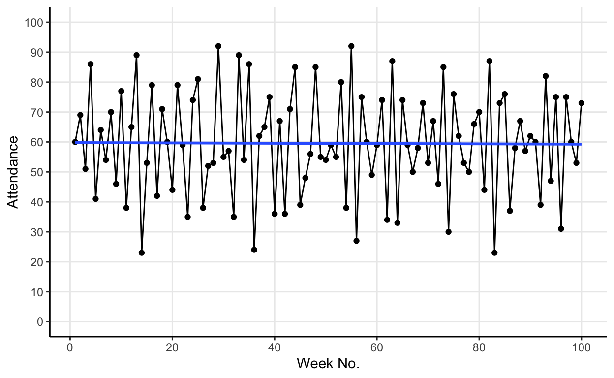
The blue line in the graph is a linear model of attendance over time. It shows us that, whilst weekly attendance fluctuates, the mean attendance converges on the default threshold value of 60.
Comparing simulations
What if we compare two default simulations? How consistent is this apparent convergence on the threshold value?
Show code
# Sim A
default_A <- sim_el_farol()

# Sim B
default_B <- sim_el_farol()
Show code
# Viz A
plot_A <- ggplot(default_A$attendance,
                 aes(x = week_no, y = attendance)) +
  geom_line() +
  geom_point() +
  geom_smooth(method = "lm", se = F) +
  scale_x_continuous("Week No.",
                     breaks = c(seq(0, 100, 20))) +
  scale_y_continuous("Attendance",
                     breaks = c(seq(0, 100, 10)),
                     limits = c(0, 100)) +
  theme_classic() +
  theme(panel.grid.major = element_line())

# Viz B
plot_B <- ggplot(default_B$attendance,
                 aes(x = week_no, y = attendance)) +
  geom_line() +
  geom_point() +
  geom_smooth(method = "lm", se = F) +
  scale_x_continuous("Week No.",
                     breaks = c(seq(0, 100, 20))) +
  scale_y_continuous("Attendance",
                     breaks = c(seq(0, 100, 10)),
                     limits = c(0, 100)) +
  theme_classic() +
  theme(panel.grid.major = element_line())

# Plot side by side
cowplot::plot_grid(plot_A, plot_B, labels = "AUTO")
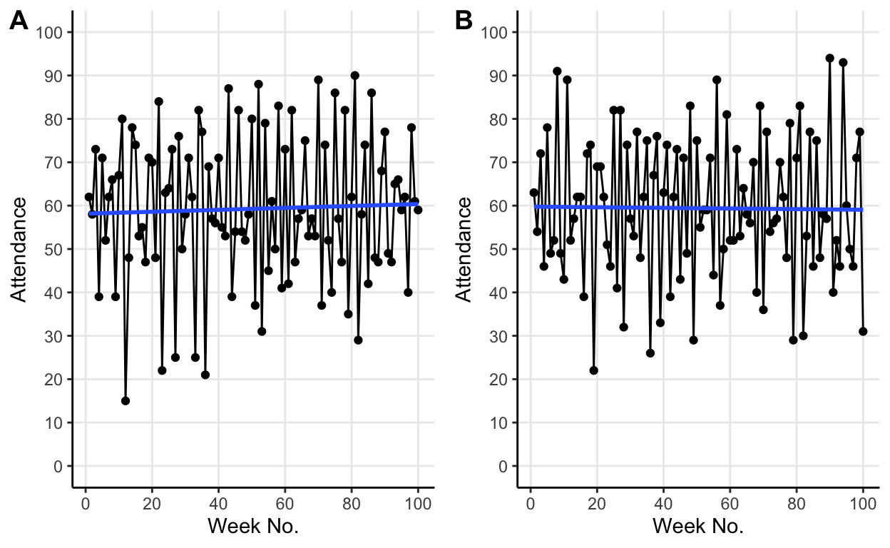
Re-running with same default parameters changes the fluctuations but average attendance still converges on the threshold value. The different fluctuations are due to the initial random allocation of hypotheses to the individuals. But crucially, we see that no matter how these fluctuations differ the same average behaviour emerges.
Changing the threshold
So, from our simulations so far, it seems like the average attendance converges on the threshold value.
Let’s test this by lowering the threshold value to 40.
Show code
# Sim A
forty_A <- sim_el_farol(threshold = 40)

# Sim B
forty_B <- sim_el_farol(threshold = 40)
Show code
# Viz A
plot_A <- ggplot(forty_A$attendance,
                 aes(x = week_no, y = attendance)) +
  geom_line() +
  geom_point() +
  geom_smooth(method = "lm", se = F) +
  scale_x_continuous("Week No.",
                     breaks = c(seq(0, 100, 20))) +
  scale_y_continuous("Attendance",
                     breaks = c(seq(0, 100, 10)),
                     limits = c(0, 100)) +
  theme_classic() +
  theme(panel.grid.major = element_line())

# Viz B
plot_B <- ggplot(forty_B$attendance,
                 aes(x = week_no, y = attendance)) +
  geom_line() +
  geom_point() +
  geom_smooth(method = "lm", se = F) +
  scale_x_continuous("Week No.",
                     breaks = c(seq(0, 100, 20))) +
  scale_y_continuous("Attendance",
                     breaks = c(seq(0, 100, 10)),
                     limits = c(0, 100)) +
  theme_classic() +
  theme(panel.grid.major = element_line())

# Plot side by side
cowplot::plot_grid(plot_A, plot_B, labels = "AUTO")
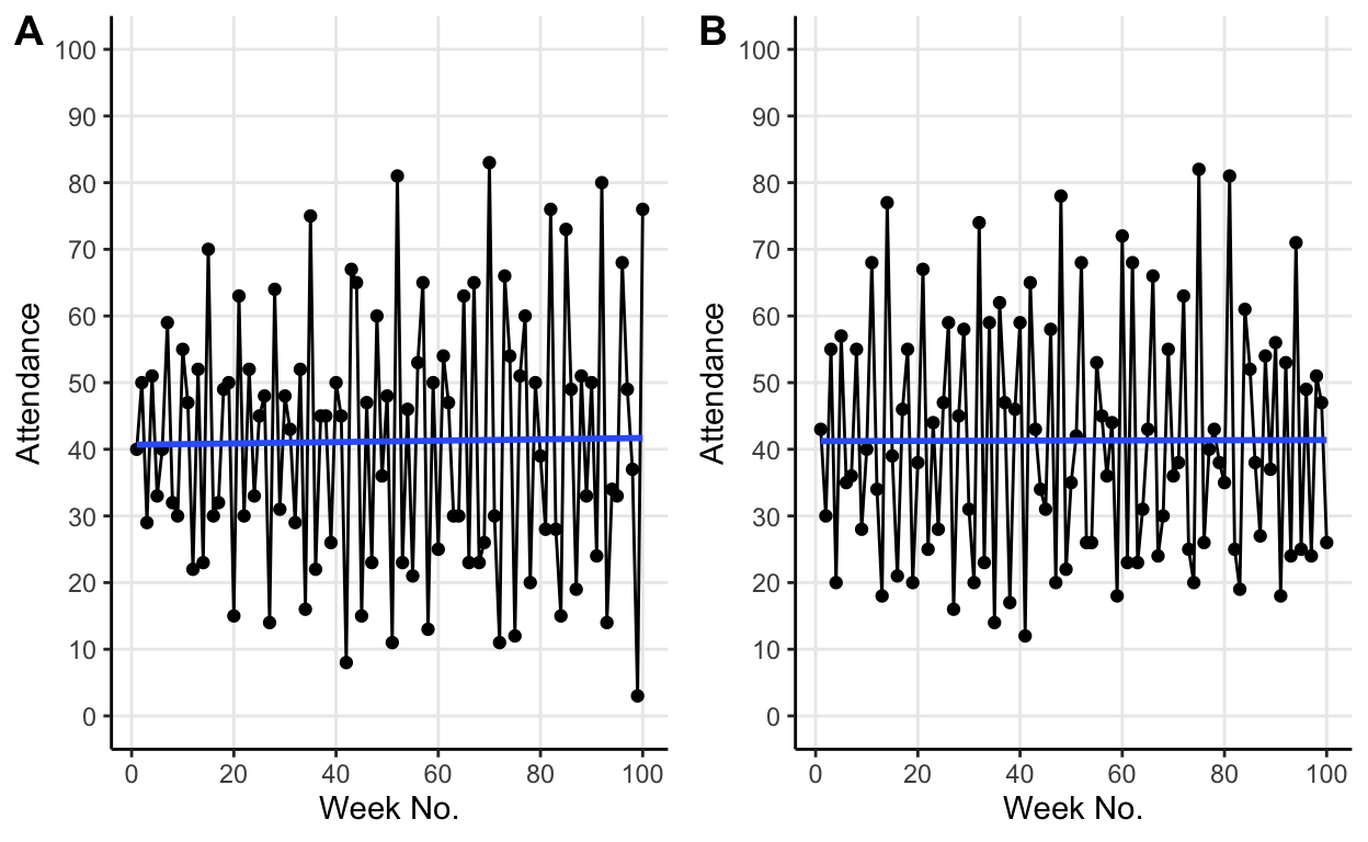
The same behaviour persists but now at the new lower threshold value.
Results
We’ve seen that the mean attendance seems to converge on the threshold value as Arthur documented in his paper. It’s not immediately obvious why this occurs. It turns out to be because the hypotheses (with the selection pressure provided by agents choosing their most accurate hypothesis) co-evolve into an ecology in which \((100-X)\%\) predict values above the threshold and \(X\%\) predict values below the threshold.
To illustrate this co-evolutionary process consider the default case with 60 as the threshold value, how do we get a \(40:60\) above:below prediction ratio? Well, imagine that instead 50% of hypotheses predicted above 60 for a few weeks in a row. As a result of these consistently high predictions average attendance would fall a little. This lower attendance would make the hypotheses predicting over 60 less accurate and thus less likely to be chosen as an agent’s current best hypothesis. Simultaneously, the lower attendance would make hypotheses predicting low values more likely to be accurate and thus more likely to be chosen for use by an agent. As more agents use hypotheses predicting low values, more agents will choose to attend the bar. Thus causing attendance to rise back up toward the threshold value of 60.
One interesting result which Arthur highlights is that whilst the population of active hypotheses (the ones that are most accurate and thus used in a given round) splits into this \((100-X):X\) ratio, it keeps changing its membership continually. He likens this to a forest whose “contours do not change, but whose individual trees do”. To partially illustrate this point I chose 10 individuals randomly from the original default simulation and plotted their individual predictions over the 100 weeks.
Show code
set.seed(13)
id_index <- sample(1:100, 10)
individuals <- default$predictions[id_index, ]
names(individuals) <- c("id", 1:100)
individuals_plot <- reshape2::melt(individuals,
                                   id.vars = "id",
                                   variable.name = "week") %>%
  mutate(id = as.factor(id),
         week = as.numeric(week))

ggplot(individuals_plot, aes(x = week, y = value, col = id)) +
  geom_line(size = 0.25) +
  geom_point(size = 0.75) +
  geom_hline(yintercept = 60, lty = 2) +
  scale_color_viridis_d("ID") +
  scale_x_continuous("Week No.",
                     breaks = c(seq(0, 100, 20))) +
  scale_y_continuous("Predicted Attendance",
                     breaks = c(seq(0, 100, 10)),
                     limits = c(0, 100)) +
  theme_classic() +
  theme(panel.grid.major = element_line())
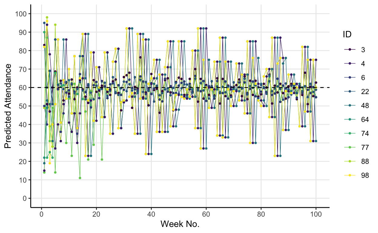
It’s a bit messy but the plot gets across Arthur’s point that the \(40:60\) ratio of hypotheses (that results in an average attendance of 60) is a consequence of different people being above and below the threshold each round. The trees change, but the forest remains the same.
Why should you care?
If you’re a bit of a nerd, one reason you might care about the El Farol problem is that it neatly illustrates the value of numerical approaches to problems where analytical ones are intractable, and the usefulness agent-based modelling, particularly when studying complex systems.
However, a more tangible reason you might care is that this toy model epitomises a surprisingly common type of problem: a coordination problem with a desired limit to coordination. Think about trying to time when you go to the lunchroom each day at work. You want it to be busy enough that there are people to talk to (i.e. you want some coordination), but not so busy that you struggle to find a seat or there’s a huge queue for the microwave (i.e. there’s a desired limit to the coordination). Some of this problem is solved by communication. You can text your mates and arrange to all go to lunch at 14.00 together. In less familiar settings, search engines often try to help us solve problems like these by displaying information about when a destination is usually busiest. But, this extra information doesn’t completely neutralise the El Farol problem. Yes, you do know that based on previous data Tesco is usually pretty empty at 3pm on a Tuesday, but then again so does everyone else.