Most non-fiction books teach you what to think. They give you a new set of facts to trot out when someone brings up pop psychology at the pub or let you feel smug when you ‘explain’ why the Bank of England cut interest rates. Every now and then, however, you read a book that changes how you think, one that helps you see things beyond its few hundred pages slightly differently. That’s what James Gleick’s Chaos did for me. It’s fantastic, I wish I’d read it much, much sooner, and anyone even remotely interested in science should make it the next thing they pick up.
Instead of butchering a full explanation of chaos, I thought I’d run through an example on my home turf. Chapter 3 of the book discusses chaos in the context of population biology by, in large part, recounting a 1976 paper from Robert May. I heard a guest lecture from him once, describing how studying complex ecosystems had helped him advise on the re-design of the banking system. It went a fair distance over my head at the time. But, I think a combination of recognising his name, familiarity with population biology, and the memory of faculty members’ deference for May, made the chapter stick in my mind. Stickiest of all was Gleick’s summary of May’s argument:
The world would be a better place… if every young student were given a pocket calculator and encouraged to play with the logistic difference equation. That simple calculation… could counter the distorted sense of the world’s possibilities that comes from a standard scientific education.
Well, R is just a fancy pocket calculator. So, we best start playing.
The logistic map
Biologists often explore how a group of individuals from the same species changes over time (a ‘population’s dynamics’). The simplest way to do this is to consider time as being discrete. This means thinking in terms of the changes from one chunk of time (day, week, season, year) to the next, rather than in continuous underlying time.
This simplification actually describes species with non-overlapping generations, such as Dawson’s burrowing bee, fairly accurately. In this case, ‘studying dynamics’ often means finding the mathemetical rules that tell us what we should expect the total number of individuals in the next generation, \(N_{t+1}\), to be, given how many individuals there are in this generation, \(N_t\). This post does include some equations, but just think of them all in this light, they’re just rules telling you how many burrowing bees you’ll have next year given how many you’ve got this year.
So, say we’re looking for an equation describing a population’s dynamics from one year to the next. The simplest option might be to say that next year’s population depends only on this year’s and nothing else. This would give us the following equation:
\[N_{t+1} = rN_t\]
which says that the number of individuals next year, \(N_{t+1}\), is just the number of individuals this year, \(N_t\), multiplied by some parameter that encapsulates the growth rate, \(r\). The growth rate \(r\) could be influenced by the climate, the species’ life-history evolution, or anything else you can think of. Just for clarity, if you have 100 individuals this year and \(r=0.5\), then next year you’ll have 50, the year after you’ll have 25, and so on.
Let’s explore three populations starting with 100 individuals which have different growth rates.
Show code
# Single input function
single_growth <- function(start_x, a, n) {

  # Empty dataframe
  pop_df <- tibble(generation = 1:n,
                   x = numeric(n))

  # Add first generation proportion
  pop_df$x[1] <- start_x

  # Simulate n generations
  for (i in 2:n) {
    pop_df$x[i] <- a*pop_df$x[i-1]
  }

  # Final dataframe
  pop_df
}

# Multiple input function
multiple_growth <- function(x_opts, a_opts, n_opts) {

  # Inputs should all be vectors

  # Find all possible input permutations
  inputs_df <- expand.grid("start_x" = x_opts,
                           "a" = a_opts,
                           "n" = n_opts)

  # Blank outcome df
  outcome_df <- tibble(start_x = numeric(),
                       a = numeric(),
                       n = numeric(),
                       generation = numeric(),
                       x = numeric())

  # Use single input function for all permutations
  for (i in 1:nrow(inputs_df)) {

    pop_df <- single_growth(start_x = inputs_df$start_x[i],
                            a = inputs_df$a[i],
                            n = inputs_df$n[i])

    current_inputs <- tibble(start_x = rep(inputs_df$start_x[i],
                                           inputs_df$n[i]),
                             a = rep(inputs_df$a[i],
                                     inputs_df$n[i]),
                             n = rep(inputs_df$n[i],
                                     inputs_df$n[i]))

    to_add <- bind_cols(current_inputs, pop_df)

    outcome_df <- bind_rows(outcome_df, to_add)
  }

  # Convert inputs into factors
  outcome_df <- outcome_df %>%
    mutate(start_x = as.factor(start_x),
           a = as.factor(a),
           n = as.factor(n))

  outcome_df
}
Show code
blah <- multiple_growth(100, a_opts = c(0.75, 1, 1.25), 10)

blah %>%
  ggplot(aes(x = generation, y = x, col = a)) +
  geom_point() +
  geom_line() +
  scale_x_continuous("Generation", breaks = 1:10) +
  scale_y_continuous("Population") +
  scale_color_viridis_d("r") +
  theme_classic() +
  theme(panel.grid.major = element_line(),
        axis.title.y = element_text(angle = 0, vjust = 0.5))
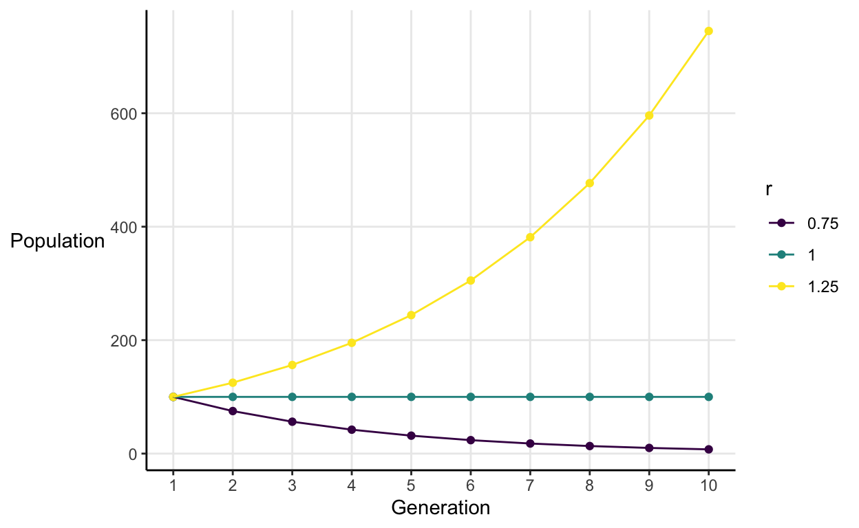
This illustrates a general pattern:
- When \(r < 1\), population goes to extinction.
- When \(r = 1\), population is constant over time.
- When \(r > 1\), population grows without limit.
Our simple model is giving us 3 pretty unrealistic predictions. Either the population ceases to exist, never changes, or takes over the entire world. So, we need to inject a little more realism. To do so, we can add in what population biologists call ‘density dependence’ and what mathematicians call ‘non-linearity’.
‘Density dependence’ encapsulates the idea that often a population’s growth rate depends on the number of individuals in that population. When the population is small, resources are abundant and the population grows as well-fed individuals reproduce. But, when the population is large, resources are scarce and the population shrinks as starving individuals die before reproducing.
To add density dependence into our model, we need the number of individuals this year to have both a positive and negative effect on next year’s population. One example is an equation of the form:
\[N_{t+1} = N_t(a - bN_{t})\]
In his paper May tells us that we can use a transformation to make this equation simpler to work with. He defines what I’ll call the population proportion in generation \(t\) as
\[x_t = \frac{bN_t}{a}\]
\(x_t\) is the population in generation \(t\) as a fraction of the maximum possible population. So, if \(x_t = 0.5\), then the current population is half as big as the biggest one the environment could support.
We can re-write this in terms of \(x\),
\[N_t = \frac{ax_t}{b}\]
and then substitute it into our equation. After some algebra we get:
\[x_{t+1} = ax_t(1-x_t)\]
This is the logistic difference equation. It’s also known as the the logistic map because it’s an equation that maps the population proportion in generation t to the population proportion in generation t+1.
Visualising complexity
Show code
# Single input function
single_map <- function(start_x, a, n) {

  # Empty dataframe
  pop_df <- tibble(generation = 1:n,
                   x = numeric(n))

  # Add first generation proportion
  pop_df$x[1] <- start_x

  # Simulate n generations
  for (i in 2:n) {
    pop_df$x[i] <- a*pop_df$x[i-1]*(1 - pop_df$x[i-1])
  }

  # Final dataframe
  pop_df
}

# Multiple input function
multiple_map <- function(x_opts, a_opts, n_opts) {

  # Inputs should all be vectors

  # Find all possible input permutations
  inputs_df <- expand.grid("start_x" = x_opts,
                           "a" = a_opts,
                           "n" = n_opts)

  # Blank outcome df
  outcome_df <- tibble(start_x = numeric(),
                       a = numeric(),
                       n = numeric(),
                       generation = numeric(),
                       x = numeric())

  # Use single input function for all permutations
  for (i in 1:nrow(inputs_df)) {

    pop_df <- single_map(start_x = inputs_df$start_x[i],
                         a = inputs_df$a[i],
                         n = inputs_df$n[i])

    current_inputs <- tibble(start_x = rep(inputs_df$start_x[i],
                                           inputs_df$n[i]),
                             a = rep(inputs_df$a[i],
                                     inputs_df$n[i]),
                             n = rep(inputs_df$n[i],
                                     inputs_df$n[i]))

    to_add <- bind_cols(current_inputs, pop_df)

    outcome_df <- bind_rows(outcome_df, to_add)
  }

  # Convert inputs into factors
  outcome_df <- outcome_df %>%
    mutate(start_x = as.factor(start_x),
           a = as.factor(a),
           n = as.factor(n))

  outcome_df
}
Stable equilibrium
When \(1<a\leq3\) the system described by the logistic map converges on a stable equilibrium population proportion of \(\frac{a-1}{a}\).
For example, if we simulate a population with a random starting point in which \(a = 2\).
Show code
stable_sim <- multiple_map(x_opts = round(runif(1), 3),
                           a_opts = 2,
                           n_opts = 100)

stable_sim %>%
  ggplot(aes(x = generation, y = x, col = start_x)) +
  geom_line() +
  scale_x_continuous("Generation") +
  scale_y_continuous("Pop.\nProp.",
                     limits = c(0, 1),
                     breaks = c(0, .25, .5, .75, 1)) +
  scale_color_viridis_d("Starting\nPoint") +
  theme_classic() +
  theme(panel.grid.major = element_line(),
        axis.title.y = element_text(angle = 0, vjust = 0.5))
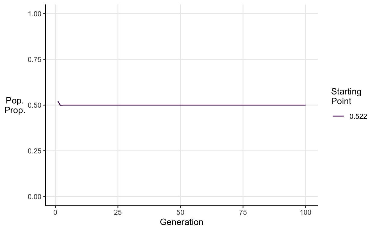
We see that then the population converges on a stable equilibrium proportion.
\[\frac{a-1}{a} = \frac{2-1}{2} = 0.5\]
To understand why this happens, let’s visualise the logistic map function itself when \(a=2\).
Show code
log_map_df <- expand.grid(a = 2, x = c(seq(0, 1, 0.01))) %>%
  mutate(y = a*x*(1-x), a = as.factor(a))

log_map_df %>%
  ggplot(aes(x = x, y = y)) +
  geom_line(aes(col = a)) +
  scale_x_continuous("Population proportion at t", expand = c(0.01, 0.01)) +
  scale_y_continuous("Population\nproportion\nat t+1",
                     limits = c(0, 1),
                     expand = c(0.01, 0.01)) +
  scale_color_viridis_d("a") +
  theme_classic() +
  theme(panel.grid.major = element_line(),
        axis.title.y = element_text(angle = 0, vjust = 0.5))
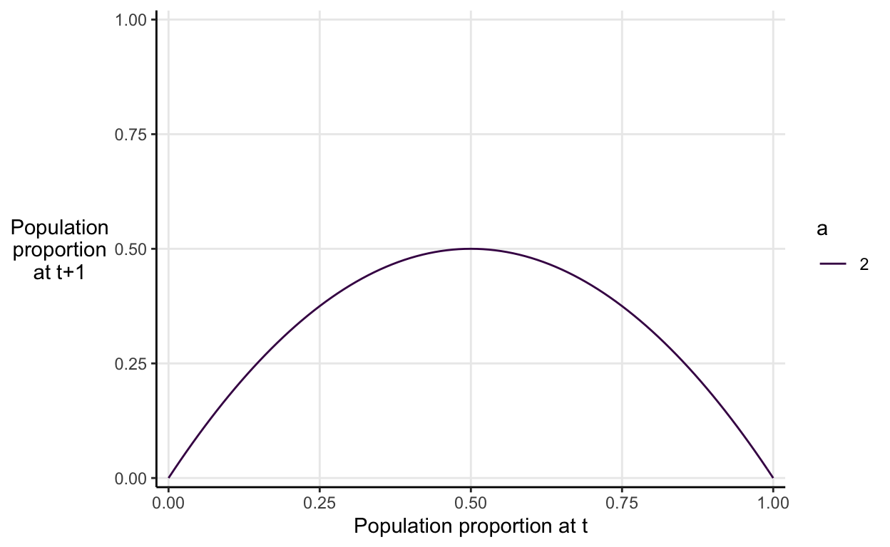
The graph neatly illustrates the idea of density dependence that I described verbally before. If the population proportion at time \(t\) is higher than 0.5, then it will be decrease in value. If the population proportion at time \(t\) is lower than 0.5, then it will increase in value. Anywhere you start on the on the x-axis the subsequent values will constrict into the the equilibrium value of 0.5 eventually.
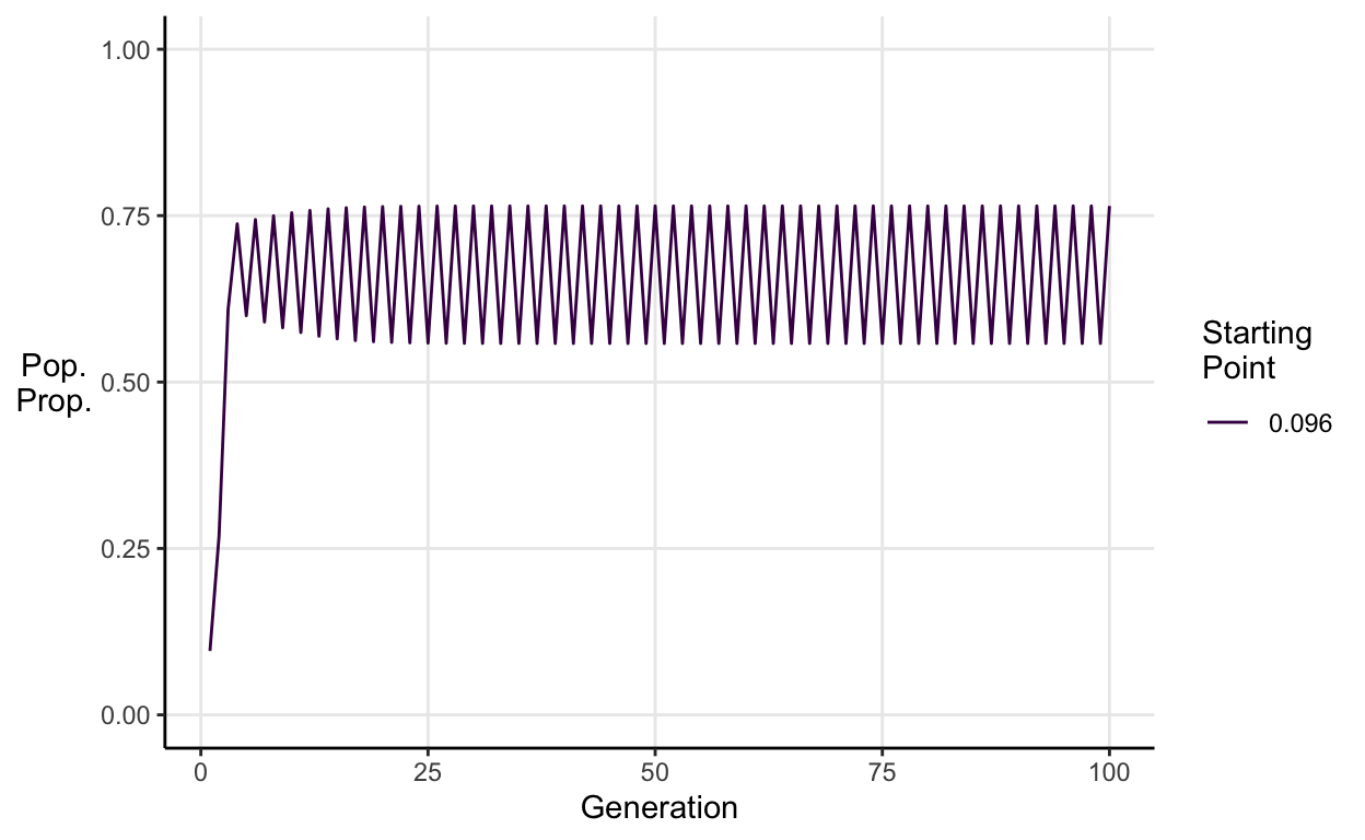
Period doubling
As you increase \(a\) past 3, the logistic map begins to exhibit cyclical behaviour.
For \(3<a\leq \approx3.45\) we see stable 2-period cycles.
E.g. \(a = 3.1\):
Show code
cycle_2_sim <- multiple_map(x_opts = round(runif(1), 3), a_opts = 3.1, n_opts = 100)

cycle_2_sim %>%
  ggplot(aes(x = generation, y = x, col = start_x)) +
  geom_line() +
  scale_x_continuous("Generation") +
  scale_y_continuous("Pop.\nProp.",
                     limits = c(0, 1),
                     breaks = c(0, .25, .5, .75, 1)) +
  scale_color_viridis_d("Starting\nPoint") +
  theme_classic() +
  theme(panel.grid.major = element_line(),
        axis.title.y = element_text(angle = 0, vjust = 0.5))
For \(\approx3.45<a\leq \approx3.54\) we see stable 4-period cycles.
E.g. \(a = 3.5\):
Show code
cycle_4_sim <- multiple_map(x_opts = round(runif(1), 3), a_opts = 3.5, n_opts = 100)

cycle_4_sim %>%
  ggplot(aes(x = generation, y = x, col = start_x)) +
  geom_line() +
  scale_x_continuous("Generation") +
  scale_y_continuous("Pop.\nProp.",
                     limits = c(0, 1),
                     breaks = c(0, .25, .5, .75, 1)) +
  scale_color_viridis_d("Starting\nPoint") +
  theme_classic() +
  theme(panel.grid.major = element_line(),
        axis.title.y = element_text(angle = 0, vjust = 0.5))
As you increase \(a\) beyond 3.54 you see 8-period cycles, then 16, then 32 etc.
E.g. Stable 8-peiod cycle simulation when \(a = 3.55\):
Show code
cycle_8_sim <- multiple_map(x_opts = round(runif(1), 3), a_opts = 3.55, n_opts = 100)

cycle_8_sim %>%
  ggplot(aes(x = generation, y = x, col = start_x)) +
  geom_line() +
  scale_x_continuous("Generation") +
  scale_y_continuous("Pop.\nProp.",
                     limits = c(0, 1),
                     breaks = c(0, .25, .5, .75, 1)) +
  scale_color_viridis_d("Starting\nPoint") +
  theme_classic() +
  theme(panel.grid.major = element_line(),
        axis.title.y = element_text(angle = 0, vjust = 0.5))
Chaos
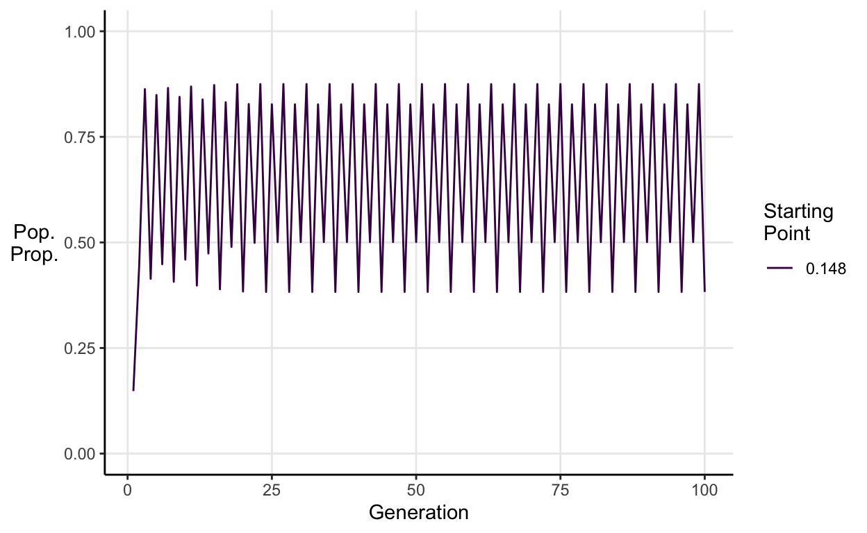
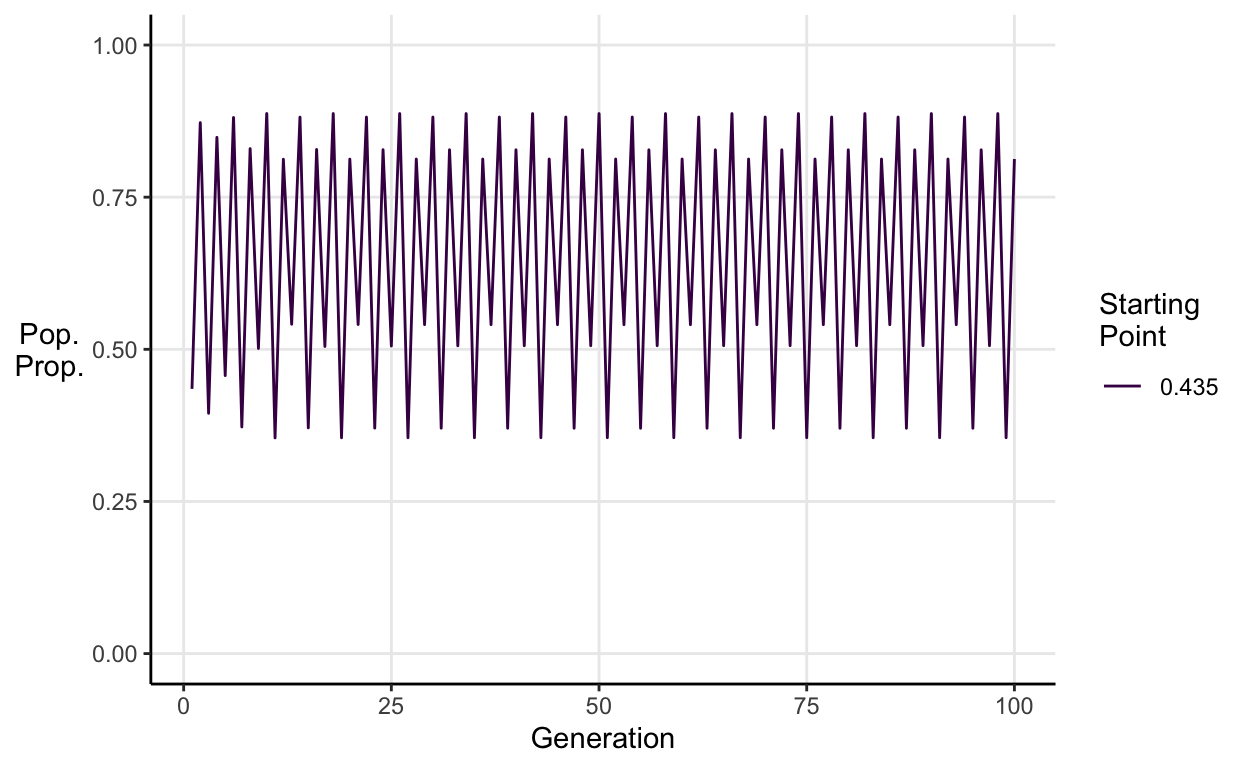
Now for the really interesting part. When \(a \approx 3.56995\), the logistic map is chaotic. This means it exhibits aperiodic behaviour that depends sensitively on initial conditions. In english, that means there are no repeating patterns and two populations which start at values very close to one another end up with very different dynamics.
E.g. \(a = 3.65\):
Show code
chaos_sim <- multiple_map(x_opts = round(runif(1), 3),
                          a_opts = 3.65,
                          n_opts = 100)

chaos_sim %>%
  ggplot(aes(x = generation, y = x, col = start_x)) +
  geom_line() +
  scale_x_continuous("Generation") +
  scale_y_continuous("Pop.\nProp.",
                     limits = c(0, 1),
                     breaks = c(0, .25, .5, .75, 1)) +
  scale_color_viridis_d("Starting\nPoint") +
  theme_classic() +
  theme(panel.grid.major = element_line(),
        axis.title.y = element_text(angle = 0, vjust = 0.5))
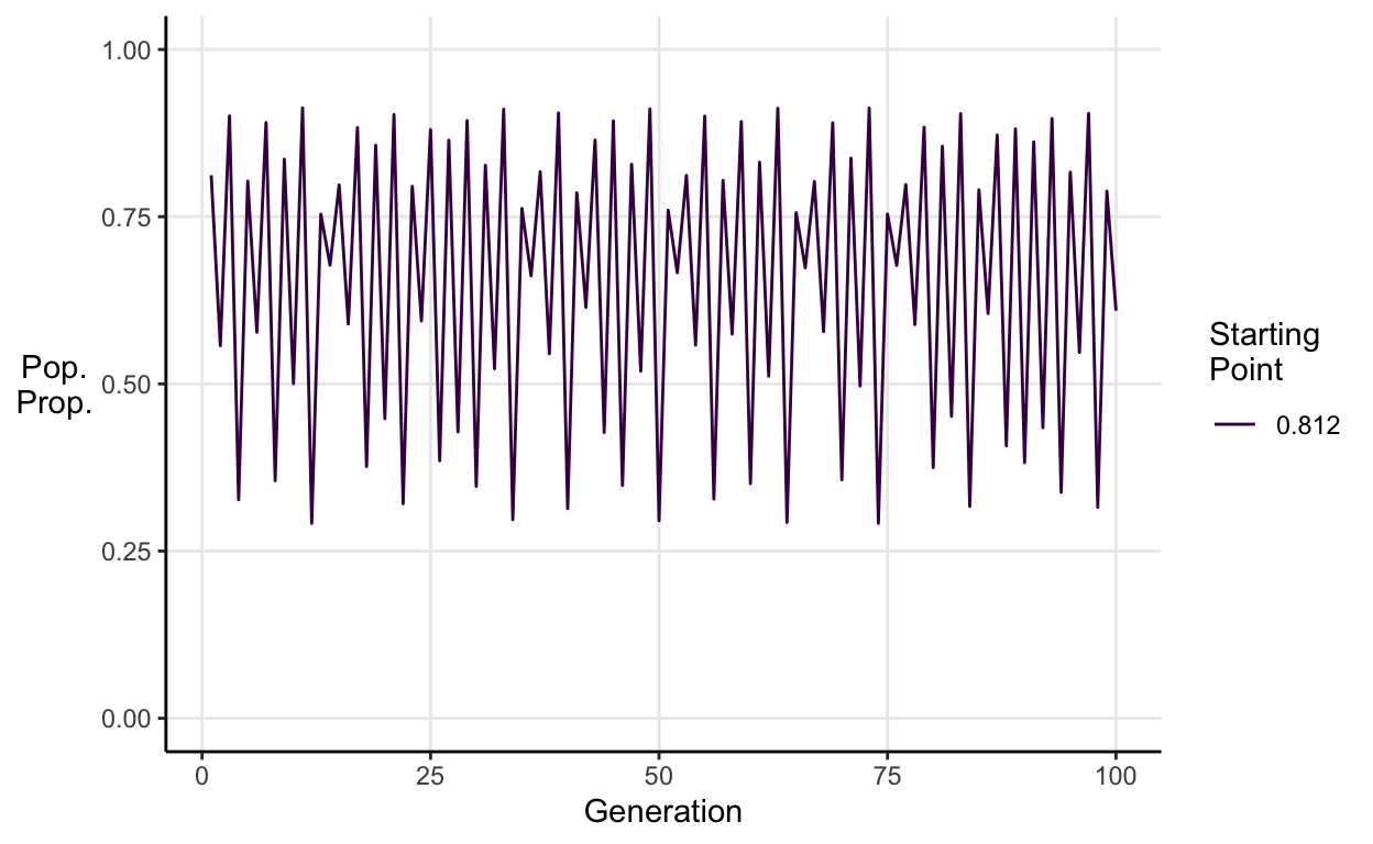
This chaotic behaviour renders long-term prediction impossible for two reasons. First, it means the system cannot be reduced to a neat forecasting formula as systems with linear dynamics can. Second, as very similar starting points generate very different endings, any small error in the initial measurements (which will always exist because you can’t measure the world to infinite precision) will lead to wildly incorrect predictions.
Bifurcation diagram
May summarised all of the behaviour we’ve seen so far into a single graph called a bifurcation diagram. It shows how the eventual population proportion changes with the value of \(a\).
I made my own version by simulating 100 generations across a range of starting values and values of \(a\).
Show code
bifurc_sim <- multiple_map(x_opts = seq(0.02, 0.98, 0.02),
                           a_opts = seq(2, 4, 0.005),
                           n_opts = 100)

final_props <- bifurc_sim %>%
  filter(generation == 100) %>%
  mutate(a = as.numeric(as.character(a)),
         x = as.numeric(x))
Show code
ggplot(final_props, aes(x = a, y = x)) +
  geom_point(size = 0.3, col = "#440154FF") +
  scale_y_continuous("'Final' population\nproportion x") +
  scale_colour_viridis_c(guide = "none", direction = -1) +
  theme_classic() +
  theme(panel.grid.major = element_line(),
        axis.title.y = element_text(angle = 0, vjust = 0.5))
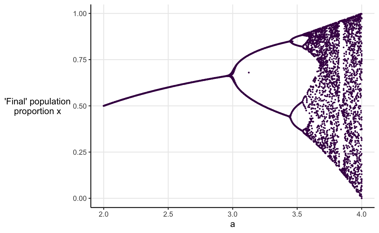
Each dot represents the population proportion in the 100th generation of one simulation. Hopefully you recognise the pattern as \(a\) increases. We see stable equilibria, followed by 2-period cycling, and then 4-period cycling, the 8-period cycling is just about perceptible, and then we’re into chaotic territory.
The graph is beautiful but, I think because it’s showing long run outcomes as a function of a tuning parameter rather than direct outcomes, I found it very counter-intuitive when I first saw it.
Fortunately, there’s been more than 40 years’ worth of technological advancement since May’s paper. This means we can build an interactive tools that hopefully makes May’s point a little easier to grasp.
Building non-linear intuitions
I think that a good way to build intuition about a problem is to tinker with it and see what happens. So, I made a shiny app that helps you to play around with the logistic map.
The idea is to compare 3 different imaginary populations.
- You choose the starting point for each population.
- You choose how many generations to simulate.
- You choose the values of \(a\) to compare across.
Then, you can use the interactive graph that appears to build intuitions about non-linearity.
- Click the play button to see how the simulations of your 3
populations change as the value of \(a\) changes.
- Regardless of which starting values you choose, you’ll see the same process we worked through in the previous section.
- First, there’s stability with the population converging on a single equilibrium value
- Then, there’s a transition to 2-period cycling with the population switching between two values, next 4-period cycling, 8-period cycling, and so on.
- Eventually, there’s chaos.
- You can shift the slider manually to see how the populations transition more slowly.
- You can hover over the lines to see what value a particular population has in a given generation for that value of \(a\).
- Try picking starting values close to one another and see how for the chaotic values of \(a\) the populations end up looking very different.
Studying non-elephant animals
In the conclusion of his paper, May argues that non-linearity should be taught, and taught early. As he saw it, learning to extend linear mathemetics with Fourier transforms, orthogonal functions, and regression techniques, misleads scientists about the world they’re trying to understand.
“The mathmetical intuition so developed ill equips the student to confront the bizarre behaviour exhibited by the simplest discrete nonlinear systems… Yet such nonlinear systems are surely the rule, not the exception, outside the physical sciences.”
The crucial notion that nonlinear systems are the norm rather than the exception is summed up in my favourite quote from Chaos which comes from the mathematician Stanislaw Ulam. He quipped that “to call the study of chaos ‘nonlinear science’ was like calling zoology ‘the study of nonelephant animals’”.
The fact that vast swathes of science emphasise linearity has important implications. For one, it means that people tend to think too much in terms of direct effects rather than the indirect effects and feedback loops that govern most real-world systems. May’s final sentence from over 40 years ago still rings true:
“Not only in research, but also in the everyday world of politics and economics, we would all be better off if more people realized that simple nonlinear systems do not necessarily possess simple dynamical properties.”